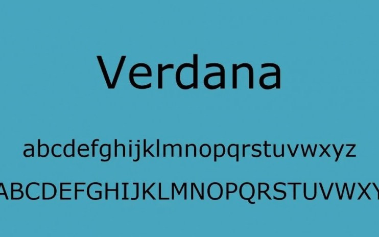
Verdana Sans Serif Font is a humanist sans-serif typeface designed by Matthew Carter for Microsoft Corporation, with hand-hinting done by Thomas Rickner, then at Monotype. Demand for such a typeface was recognized by Virginia Howlett of Microsoft’s typography group and commissioned by Steve Ballmer. The name “Verdana” is based on verdant (something green), and Ana (the name of Howlett’s eldest daughter).
Bearing similarities to humanist sans-serif typefaces such as Frutiger, Verdana was designed to be readable at small sizes on the low-resolution computer screens of the period. Like many designs of this type, Verdana has a large x-height (tall lower-case characters), with wider proportions and looser letter-spacing than on print-orientated designs like Helvetica.
The counters and apertures are wide, to keep strokes clearly separate from one another, and similarly-shaped letters are designed to appear clearly different to increase legibility for body text. The bold weight is thicker than would be normal with fonts for print use, suiting the limitations of onscreen display. Carter has described spacing as an area he particularly worked on during the design process.


Font info
| Designer Name: | Matthew Carter |
| Date: | Sep 20, 2022 |
| Downloads: | 7546 |
| Classification: | Basic Font, Sans Serif |
| License: | Free for Personal Use |


Leave your comment